By Desiree Dighton, Assistant Editor
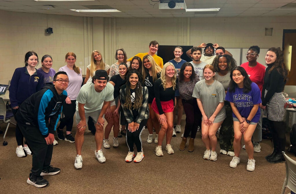
As a writer and teacher, I’ve spent a lot of time thinking and talking about details. In writing classrooms, those details are the concrete, vivid language that shows a duck to be a merganser or even a bufflehead. Language details might evoke setting through changing a juniper to a cypress or reveal a character through a ripped blouse or the dangle of reading glasses. As I assigned the undergraduates in my document design course the task of formatting and styling book reviews for NCLR’s next issue, we had to shift our thinking away from the concrete details that create what John Gardner called the “vivid and continuous dream” of good fiction writing. We didn’t give up thinking of details, but the details changed. We focused on the often taken for granted bits and bobs involved in magazine publication. These may not be the concrete details that make us fall in love with a piece of writing, but they are the details of publishing layout and design that allow readers to immerse themselves in that very dream.
Part of any magazine’s duty is getting those details right. In the document design course, we’d read about the importance of concepts like contrast, repetition, alignment, and proximity—students had even practiced applying those concepts in designs of their own—but opening Word files of book reviews and figuring out how to get them into magazine form had a whole different vibe. Students began by sorting through digital folders, discovering books from newcomers and established writers alike. As I leaned over their workstations, I spotted a review for Mother Country, Jacinda Townsend’s latest novel. Townsend, both a Duke Law and Iowa MFA alumna, was also one of my fiction professors during my MFA studies at Southern Illinois (She’s now at the University of Michigan), and seeing her work reminded me of the awesome responsibility of editors and magazines—to do right by taking care of both our readers and writers—even as I thought I could hear students’ hearts race as their fingers stumbled to find the selection tool, the character tab, and the layout icons. Would we be able to learn the intricacies of InDesign well enough—a challenging Adobe software inconspicuously present behind most good publications and totally new and frustrating to my undergraduate students, who are mostly non-English majors—to honor these responsibilities to NCLR and its writers and readers?
As those in publishing know, there are details of style that are generally considered, but there are also those style details particular to each in-house style guide. These details of style became paramount while students worked to lay out, format, and style NCLR’s book reviews. With Editor Margaret Bauer’s guidance and support from student intern Abby Trzepacz and editorial assistant Amber Knox, those raw book review files began to transform into the bold, color blocked book reviews that NCLR will publish, and you, dear readers, will enjoy. To get there, however, is a lot like the writing process—messy, scary, and full of small but significant triumph: Students poured book review text into templates designed by NCLR’s art director Dana Ezzell Lovelace. Once in the template, students styled text with different character and paragraph features. They aligned artwork, images, and gorgeous historic postcards like those depicting Mt. Mitchell in George Hovis’s review of Robert Morgan’s latest collection, In the Snowbird Mountains and Other Stories. Like writing, this work does not always go smoothly, but in the end, it feels good to have done it.
As students reflected on their NCLR layout and design process in remixed reflective pieces, some chose technological expressions while others opted for handmade remixes. All of them made brilliant connections to concepts and technical skills of aspects like scaling image files and attention to rhetorical design principles like visual hierarchy and balance. Rather than a typical academic essay, I gave them the leeway to employ any creative genre they’d like, a nice counterbalance, I hoped, to the vigilance involved in producing a unified and cohesive publication like NCLR. Students created reflective riffs that spanned the gamut from graphic adventure stories, to a “Mean Girls”-style burn book about InDesign, a food blogger style website of InDesign and NCLR “recipes,” a soccer gameday stats and blog, and even a Sponge Bob episode storyboard. Through it all, it was very clear to me how much they’d learned from having a professional production editing experience. We hope next time you read an NCLR book review, you know a little more about the concepts and labor at work behind the scenes. For our part, we hope we helped the brilliance of the magazine shine just a little brighter. Thank you, NCLR, and thank you students:
- Rose Brown
- Mckinley Butler
- Lois Cook
- Emily Fass
- Abigail Fletcher
- Maddie Gipp
- Jaylyn Gore
- Anna Hancock
- Layla Hope
- Kendall Knox
- Diego Lerma
- Garrett Moore
- Favour Nako
- Nicky Nieto Ramirez
- Austin Norton
- Alissa OBryan
- Keni Orourke
- Morgan Rock
- Madeline Rushing
- Olivia Russell
- Claire StCyr
- Justin Trinh
- Andres Vazquez